Now and then I come across a Python package that has the potential to simplify a task that I do regularly. When this happens, I’m always excited to try it out and, if it’s awesome, share my new knowledge.
A couple of months ago, I was browsing Twitter when I saw a tweet about Yellowbrick, a package for model visualization. I tried it, liked it, and now incorporate it into my machine learning workflow. In this post I’ll show you a few examples of what it can do (and you can always go check out the documentation for yourself).
Fast facts
Some fast facts about Yellowbrick:
- Its purpose is model visualization, i.e., helping you understand visually how a given model performs on your data so you can make informed choices about whether to select that model or how to tune it.
- Its interface is a lot like that of scikit-learn. If you’re comfortable with the workflow of instantiating a model, fitting it to training data, and then scoring or predicting in one line of code each, then you’ll pick up Yellowbrick very quickly.
- Yellowbrick includes “visualizers” (a class specific to this package) based on Matplotlib for the main types of modeling applications, including regression, classification, clustering, time series modeling, etc., so there’s probably one to help with most of your everyday modeling situations.
Overall opinion
Overall, I enjoy using Yellowbrick because it saves me time on some routine tasks. For instance, I have my own code for visualizing feature importances or producing a color-scaled confusion matrix that I copy from project to project, but Yellowbrick lets me quickly and easily produce an attractive plot in fewer lines of code.
The downside to this easy implementation, of course, is that you don’t have as much control over how the plot looks as you would if you coded it yourself. If the visualization is just for your benefit, fine; but if you need to manipulate the plot in any way, prepare to dig into the documentation. A fair trade, for sure, but just consider the end user of your plot before you begin so you don’t have to do things twice (once in Yellowbrick, once in Matplotlib/Seaborn/etc.).
Speaking of doing things twice, let’s take a look at the same visualization routine in Yellowbrick v. Matplotlib.
Feature importances with Yellowbrick v. Matplotlib
For this little case study, I’m going to fit a Random Forest classifier to the UCI wine dataset, then use a barplot to visualize the importance of each feature for prediction. The dataset is smallish (178 rows, 13 columns), and the purpose of the classification is to predict which of three cultivars a wine contains based on various features.
First, the basics:
# Import basic packages
import pandas as pd
import numpy as np
import matplotlib.pyplot as plt

# In Jupyter Notebook, run this to display plots inline
%matplotlib inline

# Get the dataset from sklearn
from sklearn.datasets import load_wine
data = load_wine()

# Prep features and target for use
X = data.data
X = pd.DataFrame(X)
X.columns = [x.capitalize() for x in data.feature_names]

y = data.target
In the code above I grabbed the data using sklearn’s built-in load_wine() class and split it into features (X) and target (y). Note that I took the extra step of converting X to a DataFrame and giving the columns nice capitalized names. This will make my life easier when it comes time to build the plots.
Let’s take a look at the Yellowbrick routine first. I’ll instantiate a RandomForestClassifier() and a FeatureImportances() visualizer, then fit the visualizer and display the plot.
# Import model and visualizer
from yellowbrick.model_selection import FeatureImportances
from sklearn.ensemble import RandomForestClassifier

# Instantiate model and visualizer
model = RandomForestClassifier(n_estimators=10, random_state=1)
visualizer = FeatureImportances(model)

# Fit and display visualizer
visualizer.fit(X, y)
visualizer.show();
And this is what you get:
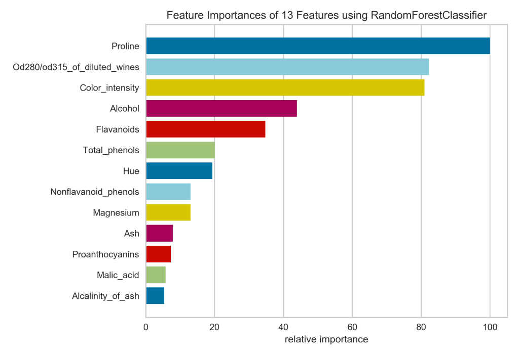
In four lines of code (not counting the import statements), I’ve got a respectable looking feature importances plot. I can see at a glance that the proline is really important for identifying the cultivar, while malic acid and alkalinity of ash are not.
A couple of tiny gripes:
- The colors don’t convey any real information, so if I were hand-coding this, I would keep all bars the same color.
- The x-axis has been relabeled to express the relative importance of each feature as a percentage of the importance of the most important feature. So proline, the most important feature, is at 100%, and alkalinity of ash is around 5%. I would rather see the feature importance values calculated by the Random Forest model, since even the most important feature might explain only a tiny fraction of the variance in the data. The Yellowbrick plot masks the absolute feature important in favor of presenting the relative importance, which we could infer that from the lengths of the bars in the plot!
Now let me show you what it would take to build the exact same plot by hand in Matplotlib. I’ll start by fitting the RandomForestClassifier():
# Fit a RandomForestClassifier
from sklearn.ensemble import RandomForestClassifier
model = RandomForestClassifier(n_estimators=10, random_state=1)
model.fit(X, y)
Note that I instantiated the model with the same number of estimators and random state as the one above, so the feature importance values should be exactly the same.
Here’s the basic code I usually use when plotting feature importances:
# Plot feature importances
n_features = X.shape[1]
plt.figure(figsize=(8,6))
plt.barh(range(n_features), model.feature_importances_, align='center')
plt.yticks(np.arange(n_features), X.columns)
plt.xlabel("relative importance")
plt.title('Feature Importances of 13 Features Using RandomForestClassifier')
plt.show();
And here’s the plot:
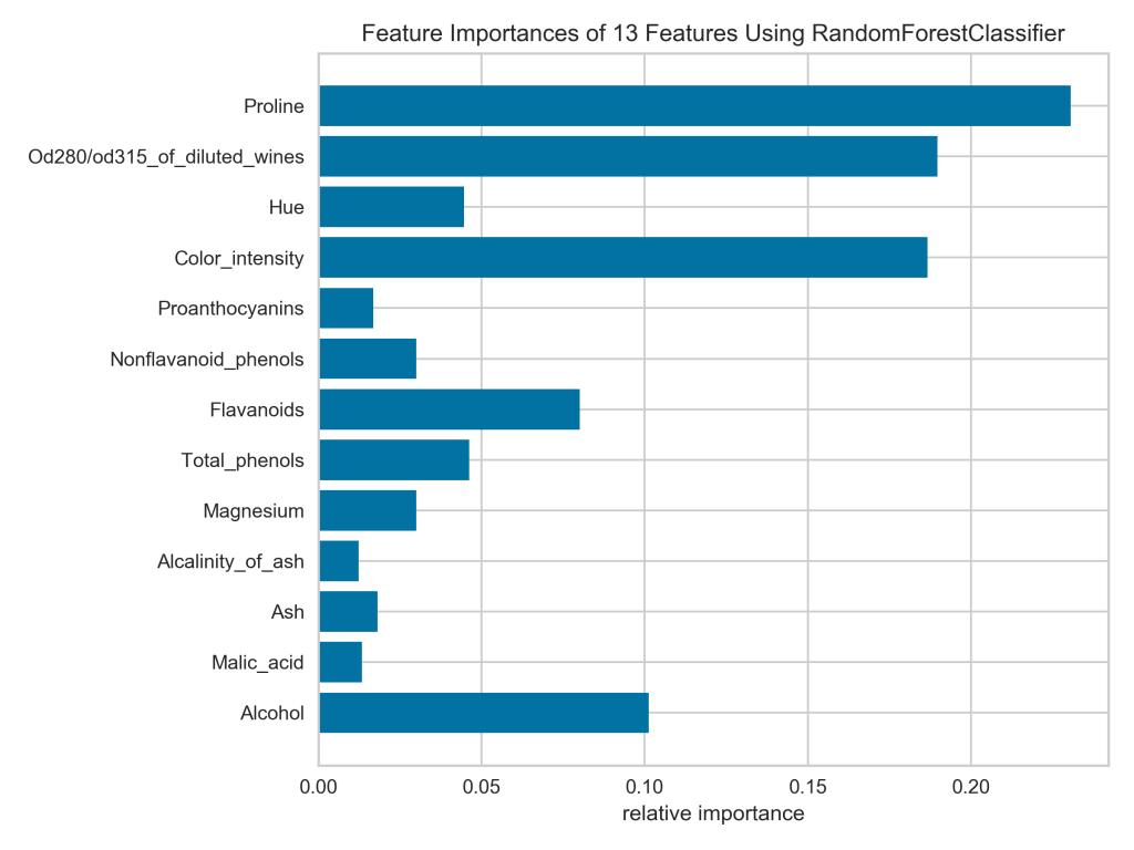
Notice that all the bars are the same color by default and the x-axis represents the actual feature importance values, which I like. Unfortunately, the bars are not sorted from widest to narrowest, which I would prefer. For example, looking at the current plot, I’m having trouble telling if nonflavanoid phenols or magnesium is more important.
Let’s see what it would take to reproduce the Yellowbrick plot exactly in Matplotlib. First of all, I have to sort the features by importance. This is tricky because model.feature_importances_ just returns an array of values with no labels, ordered just as the features are ordered in the DataFrame. To sort them, I need to associate the values with the feature names, sort, then split them back up to pass to Matplotlib.
# Zip and sort feature importance labels and values
# (Note that reverse=False by default, but I included it for emphasis)
feat_imp_data = sorted(list(zip(X.columns, model.feature_importances_)), key=lambda datum: datum[1], reverse=False)

# Unzip the values and labels
widths = [x[1] for x in feat_imp_data]
yticks = [x[0] for x in feat_imp_data]
n_features = X.shape[1]

# Build the figure
plt.figure(figsize=(8,6))
plt.barh(range(n_features), widths, align='center')
plt.yticks(np.arange(n_features), yticks)
plt.xlabel("relative importance")
plt.title('Feature Importances of 13 Features Using RandomForestClassifier')
plt.show();
A quick but crucial note: see how I sorted the feature importances in ascending order? That’s because Matplotlib will plot them starting from the bottom of the plot. Take it from me, because I learned the hard way: if you want to display values in descending order (top-bottom), pass them to Matplotlib in ascending order.
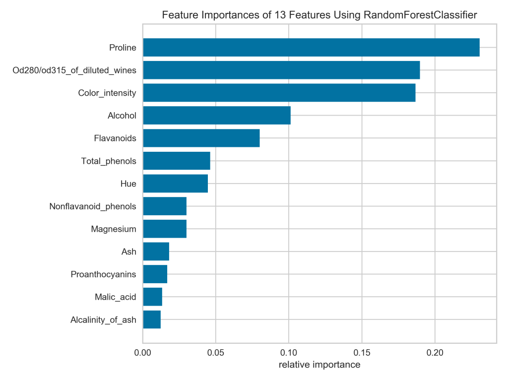
That’s much easier to read! Now if I really wanted to duplicate the Yellowbrick plot in Matplotlib, I would also need to supply the colors and the x-tick labels, as well as remove the horizontal grid lines.
# First set up colors, ticks, labels, etc.
colors = ['steelblue', 'yellowgreen', 'crimson', 'mediumvioletred', 'khaki', 'skyblue']
widths = [x[1] for x in feat_imp_data]
xticks = list(np.linspace(0.00, widths[-1], 6)) + [0.25]
x_tick_labels = ['0', '20', '40', '60', '80', '100', '']
yticks = [x[0] for x in feat_imp_data]
n_features = len(widths)

# Now build the figure
plt.figure(figsize=(8,6))
plt.barh(range(n_features), widths, align='center', color=colors)
plt.xticks(xticks, x_tick_labels)
plt.yticks(np.arange(n_features), yticks)
plt.grid(b=False, axis='y')
plt.xlabel("relative importance")
plt.title('Feature Importances of 13 Features Using RandomForestClassifier')
plt.show();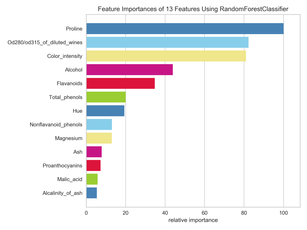
In case you’re wondering, it took me about an hour of tinkering to recreate the Yellowbrick plot in Matplotlib. This included sorting the bars from biggest to smallest, guessing the colors and struggling to get them in the right order, resetting the x-axis ticks and labels to the 100% scale, and removing the horizontal gridlines.
Moral of the story: if a Yellowbrick plot will meet your needs, then it’s a much quicker way to get there than via Matplotlib. Of course, you’re never going to beat plain vanilla Matplotlib for granularity of control.
More fun with Yellowbrick
There is plenty more you can do to visualize your machine learning models with Yellowbrick; be sure to check out the documentation. Here are just a few more quick examples:
Example 1: A color-coded confusion matrix (using the same wine data and Random Forest model as above).
# Import what we need
from sklearn.model_selection import train_test_split
from yellowbrick.classifier import ConfusionMatrix

# Split the data for validation
X_train, X_test, y_train, y_test = train_test_split(X, y, test_size=0.2, random_state=1)

# Instantiate model and visualizer
model = RandomForestClassifier(n_estimators=10, random_state=1)
matrix = ConfusionMatrix(model, classes=['class_0', 'class_1', 'class_2'])

# Fit, score, and display the visualizer
matrix.fit(X_train, y_train)
matrix.score(X_test, y_test)
matrix.show();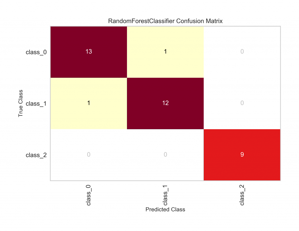
And here’s the code I used in a recent machine learning project to build something similar myself. Note that my function takes the true and predicted values, which I would have to calculate beforehand, while Yellowbrick gets its values from the .score() method.
# Define a function to visualize a confusion matrix
def pretty_confusion(y_true, y_pred, model_name):
    '''Display normalized confusion matrix with color scale.

    Edit the class_names variable to include appropriate classes.

    Keyword arguments:
    y_true: ground-truth labels
    y_pred: predicted labels
    model_name: name to print in the plot title

    Dependencies:
    numpy aliased as np
    sklearn.metrics.confusion_matrix
    matplotlib.pyplot aliased as plt
    seaborn aliased as sns
    '''

    # Calculate the confusion matrix
    matrix = confusion_matrix(y_true, y_pred)
    matrix = matrix.astype('float') / matrix.sum(axis=1)[:, np.newaxis]

    # Build the plot
    plt.figure(figsize=(16,7))
    sns.set(font_scale=1.4)
    sns.heatmap(matrix, annot=True, annot_kws={'size':10}, cmap=plt.cm.Greens, linewidths=0.2)

    # Add labels to the plot
    class_names = ['Spruce/Fir', 'Lodgepole Pine', 'Ponderosa Pine', 'Cottonwood/Willow', 'Aspen', 'Douglas-fir', 'Krummholz']
    tick_marks = np.arange(len(class_names))
    tick_marks2 = tick_marks + 0.5
    plt.xticks(tick_marks, class_names, rotation=25)
    plt.yticks(tick_marks2, class_names, rotation=0)
    plt.xlabel('Predicted label')
    plt.ylabel('True label')
    plt.title('Confusion Matrix for {}'.format(model_name))
    plt.tight_layout()
    plt.show();

# Plot the confusion matrix
pretty_confusion(y_true, y_pred, 'Random Forest Model')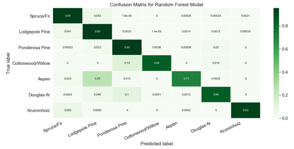
Example 2: A t-SNE plot to show how two classes of texts overlap. I won’t go into detail about the data and model here, but you can check out the relevant project on my GitHub.
# Import needed packages
from sklearn.feature_extraction.text import TfidfVectorizer
from yellowbrick.text import TSNEVisualizer

# Prepare the data
tfidf = TfidfVectorizer()
X = tfidf.fit_transform(data.text)
y = data.target

# Plot t-SNE
tsne = TSNEVisualizer()
tsne.fit(X, y)
tsne.show();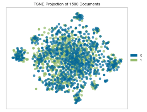
I don’t even know how hard this would be do to in Matplotlib because I’ve never tried. The result I got from Yellowbrick was enough to answer my question, and I was able to take that information and move on quickly.
I hope you make time to experiment with Yellowbrick. I’ve had fun and learned about some new model visualization techniques while using it, and I bet you will, too.