I recently had the opportunity to complete an open-ended data analysis project using a dataset from Instacart (via Kaggle). After a bit of exploration, I decided that I wanted to attempt a customer segmentation. Luckily, I found an article by Tern Poh Lim that provided inspiration for how I could do this and generate some handy visualizations to help me communicate my findings. In this post I’ll walk through how I adapted RFM (recency, frequency, monetary) analysis for customer segmentation on the Instacart dataset. Since the dataset doesn’t actually contain timestamps or any information about revenue, I had to get a bit creative!
Check out those shopping carts
If you’re unfamiliar with it, Instacart is a grocery shopping service. Users order their groceries through an app, and just as with other gig-economy companies, a freelance “shopper” takes responsibility for fulfilling user orders. The Instacart Market Basket Analysis dataset was engineered for a specific application: to try to predict which items a customer would order again in the future. If you inspect the documentation on Kaggle, you’ll see that the dataset contains the following types of information:
- a record for every order placed, including the day of week and hour of day (but no actual timestamp);
- a record of every product in every order, along with the sequence in which each item was added to a given order, and an indication of whether the item had been ordered previously by the same customer; and
- the name, aisle, and department of every product.
The data has been thoroughly anonymized, so there is no information about users other than user ID and order history—no location data, actual order dates, or monetary values of orders.
This is important to note because those missing types of information are some of the most important for business analytics. Companies very much want to know whether a user has been active recently, how active they have been over the past day/week/month/quarter, and what their monetary value is to the company. If I wanted to do a customer segmentation with this dataset, I would have to find a creative solution.
Customer segmentation: the basics
In basic terms, customer segmentation means sorting customers into groups based on their real or likely behavior so that a company can engage with them more effectively. For instance, a company could offer one type of promotion or discount to its most loyal customers and a different incentive to new or infrequent customers.
A typical way to approach customer segmentation is to conduct RFM analysis. (Here’s a good intro to RFM analysis.) RFM stands for “recency, frequency, monetary,” representing some of the most important attributes of a customer from a company’s point of view. To conduct this analysis, you would collect the relevant data on each customer and sort customers into groups based on similar values for each of the RFM variables. The math behind this can be more or less complex depending on whether you want to weight the RFM variables differently.
Tern Poh Lim’s article outlines how you can do this same analysis using k-means to sort customers into clusters. Even better, he points out that you can use k-means iteratively to figure out the best number of clusters to use, taking a lot of the guesswork out of the clustering process. As you’ll see below, I adapted some of his code for producing an elbow plot using the silhouette score for various numbers of clusters and for producing snake plots to summarize the attributes of each cluster. But I’m getting ahead of myself! First, let’s take a look at my overall approach to segmenting the Instacart customers.
Steps toward segmentation
There are four basic steps I took to segment the Instacart customers:
- Engineer some features to replace RFM, since I don’t have the right data for those variables;
- Use elbow plots to determine the best number of clusters to calculate;
- Create TSNE plots and inspect the clusters for easy separability;
- Describe the key attributes of each cluster.
Step 1: Feature engineering
In the absence of appropriate data for an RFM analysis, I had to create some features that would capture similar aspects of user behavior. After some experimentation, I landed on three features that are actually pretty similar to RFM:
- total number of orders per customer;
- average lag (in days) between orders per customer; and
- average size of orders (in products) per customer.
The total orders and average lag per customer are similar to recency and frequency; they capture how much the customer uses Instacart (although in this case, that usage is spread over an undefined period). The average size of orders per customer is kind of a proxy for monetary value. Although I’m not sure exactly how Instacart assesses delivery and service fees, I made a general assumption that the size of an order might have something to do with its monetary value (and at least its size is something I can actually measure!). Even if my features don’t map perfectly onto RFM, they still capture a lot of important information about how customers are using Instacart.
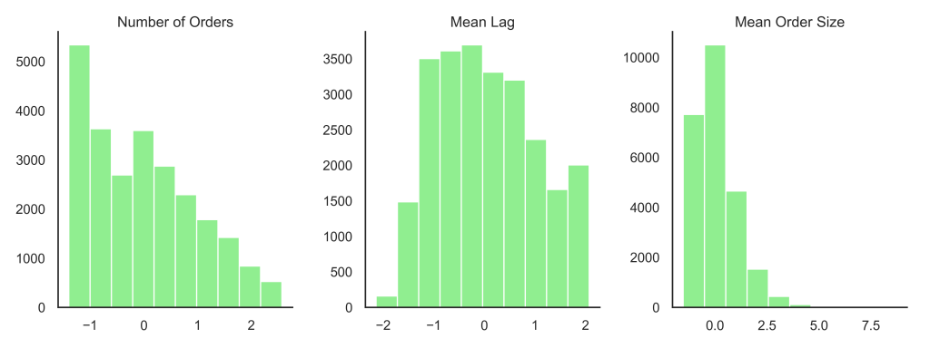
Since I would be passing these features to a k-means algorithm, I needed to watch out for non-normal distributions and outliers, since clustering is easily influenced by both of those things. When I checked the distributions of my three features, the number of orders per customer showed a strong positive skew. I used a log transformation to address this. Then I standardized all three features (using sklearn.preprocessing.StandardScaler) to mitigate the effects of any remaining outliers. With that, I was ready for the next step!
Step 2: Determine best k
K-means can sort your customers into clusters, but you have to tell it how many clusters you want. This can be tricky. Would two clusters make sense? How about 10? By testing a bunch of values for k, we can get a clearer idea of how many clusters are actually a good fit for our data.
There are several metrics we can use to evaluate how well k clusters fit a given dataset. For my project, I used two metrics: distortion score and silhouette score.
Distortion score is kind of like residual sum of squares; it measures the error within a cluster, or the distance between each datapoint and the centroid of its assigned cluster. A lower distortion score means a tighter cluster, which means the customers in that cluster would have a lot in common.
Silhouette score compares the distance between any given datapoint and the center of its assigned cluster to the distance between that datapoint and the centers of other clusters. Basically, silhouette score is asking, “Is this point actually closer to the center of some other cluster?” Again, we want this value to be low, meaning our clusters are tighter and also farther from each other in the vector space.
I put these two metrics to work in elbow plots, which display the scores for models with various numbers of clusters. I arbitrarily chose a range of 2 to 10 clusters to try. Both plots show a big change in score (or elbow) at 4 clusters.
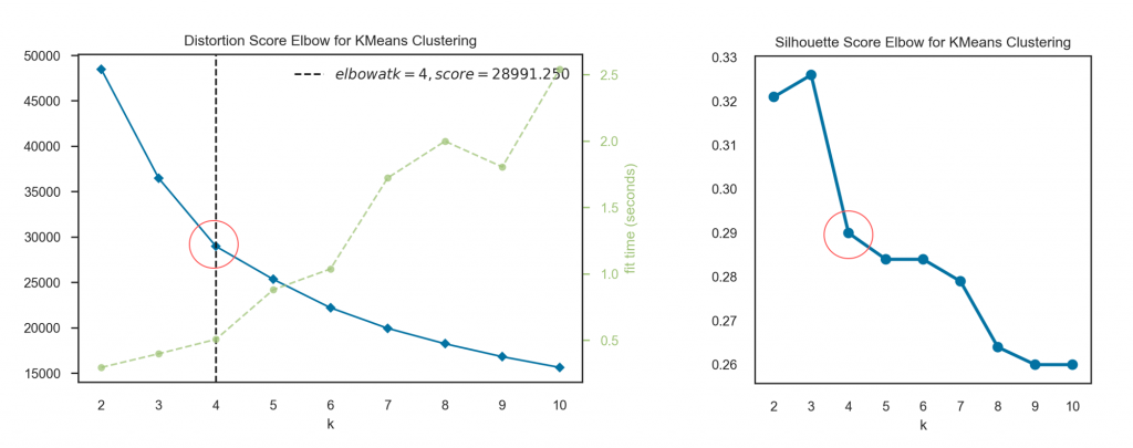
From Tern Poh Lim’s article I learned that it is common practice to proceed not just with your best k, but also k – 1 and k + 1. One of those three options is likely to give you the most separable clusters, and that’s what you want.
Step 3: Inspect the clusters for separability
What I was looking for at this step was clusters that overlap as little as possible. Any time two clusters are very close to one another, there’s a chance that any one customer near the edge of one cluster would fit better in the cluster next door. We don’t want to be sending e-mails about a senior citizens’ discount to customers under 30, you know! The easier it would be to draw a straight line separating our clusters, the more likely that our cluster assignments are accurate. TSNE plots take everything we know about each customer and reduce that to just two dimensions so that we can easily see how clusters relate to one another. Check it out:
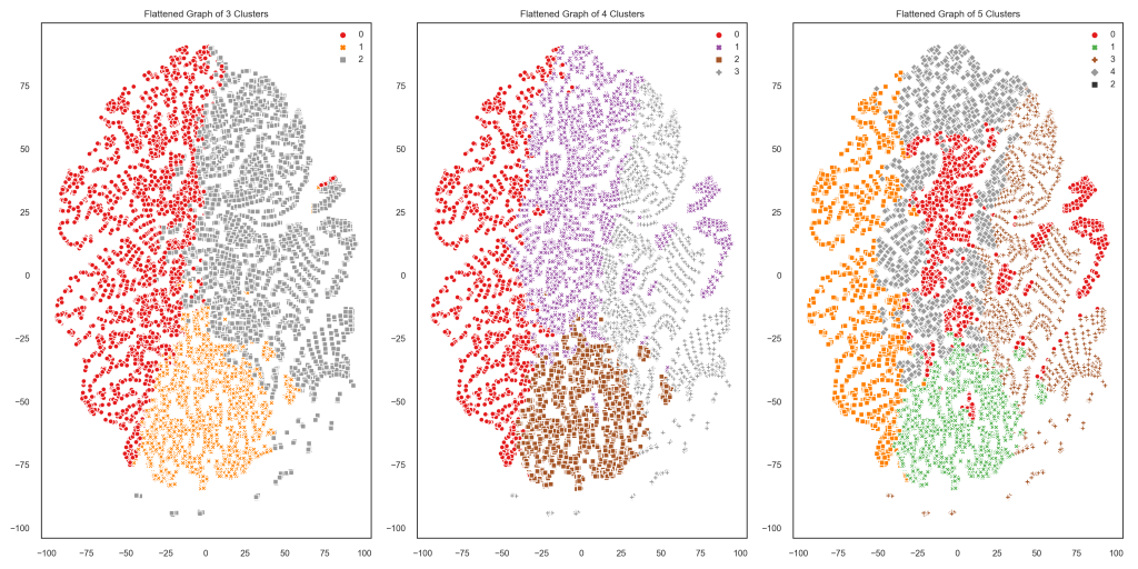
When there are only 3 clusters, they look pretty easily separable (and also fairly evenly balanced—no one cluster is much bigger than the rest). Two of the 4 clusters are overlapping a bit more than I would like, and the 5 clusters are all over the place. It looks like 3 clusters is the best choice for this customer population and these features.
Step 4: Describe each cluster
Using k = 3, I used k-means to assign every customer to a cluster. Now what? Well, you can summarize the values of each feature for each cluster to get an idea of that cluster’s purchasing habits. Again following Tern Poh Lim’s article, I used a “snake plot” (a Seaborn pointplot) to visualize the average value of each of my three features for each cluster. Here’s that plot:
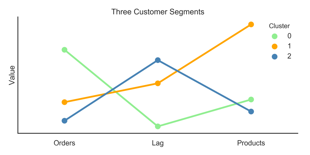
What can we do with this information? Here’s what I would recommend to a marketing team based on this plot:
- Cluster 0: These are our favorite customers! They use Instacart a lot and make medium-sized orders. Marketing for these customers could focus on maintaining their loyalty while encouraging them to place orders that bring in more revenue for the company (whether that means more items, more expensive items, etc.).
- Cluster 1: These customers don’t use Instacart as often, but when they do, they place big orders. Of course we can focus on turning them into more frequent users, and depending on exactly how Instacart generates revenue from orders, we might nudge them to make more frequent, smaller orders, or keep making those big orders.
- Cluster 2: This is the segment where we have the most room for improvement. They have tried Instacart, but they don’t use it often, and they don’t purchase many items. A marketing strategy for these folks could focus on increasing order frequency, size, or both.
I hope I’ve convinced you that you can get some pretty useful insights about customers even without the sorts of data typically used for customer segmentation. You can check out all my code for this project on my GitHub. One last shoutout to Tern Poh Lim for the inspiration (and lots of useful code) for this project!