I bet you know this feeling: an item you need is on sale, so you gleefully add it to your cart and start thinking, “What else can I buy with all this money I just saved?” A few clicks (or turns around the store) later, and you’ve got a lot more in your cart than you came for.
This is such a common phenomenon that some retailers openly exploit it. Amazon has those “add-on” items that are cheaper (or only available) if you add them to an order of a certain size. I’m pretty sure I’ve heard Target ads that crack jokes about the experience of coming to the store for something essential and leaving with a cartful of things you didn’t need but wanted once you saw what a great deal you were getting.
For a project in my data science bootcamp, I was asked to form and test some hypotheses using a database containing product and sales data from a fictional-but-realistic dealer in fine food products. It’s the Northwind database, and Microsoft created it as a sample for learning how to use some of their database products. While the data isn’t really real, it’s realistic, so most of the time it behaves the way you would expect real sales data to behave. It’s also really, really clean, which is unusual in data science.
In this post I’ll walk you through a hypothesis test using Welch’s t-test to determine whether customers spend more once they have been offered a discount (spoiler alert: they do!), and if so, how much more they spend.
If the “discount bump” is such a widely known phenomenon, you may ask, why do I even need to test the hypothesis that it exists? Well, if you were a business, and your discounts weren’t getting people to spend more, wouldn’t you want to know? What if your customers were actually taking advantage of discounts as an opportunity to save money, not to spend the same amount or more on more products? For my project I defined a business case where the Northwind company’s entire discount strategy is under examination; executives want to know what’s working and how well it’s working so they can make changes if necessary.
Hypothetically speaking
Before going any further, I want to state my hypotheses explicitly.
My null hypothesis is that the mean total dollar amount of orders with no discounted items is equal to the mean total dollar amount of orders where at least one item is discounted.
My alternative hypothesis is that the mean total dollar amount of orders with no discounted items is less than the mean total dollar amount of orders where at least one item is discounted.
Because I am trying to determine whether the mean of one distribution is greater than the mean of another, this will be a one-tailed test.
Now let’s get that data ready to roll.
Wrangling the shopping carts
In the data I collected from the Northwind database, each observation represents a unique product in a customer’s order. Each row of my table includes an identifier for the order, the identifier of the product, the quantity and unit price of that product, the percent discount applied (if any), the product’s name, its category (e.g., “Beverages”), and a number representing the category. I added on a boolean column to record the presence or absence of a discount (for easy sorting later) and a column that calculates the product’s unit price times quantity times discount (if any) to get the total price of that product in that order. Take a look:
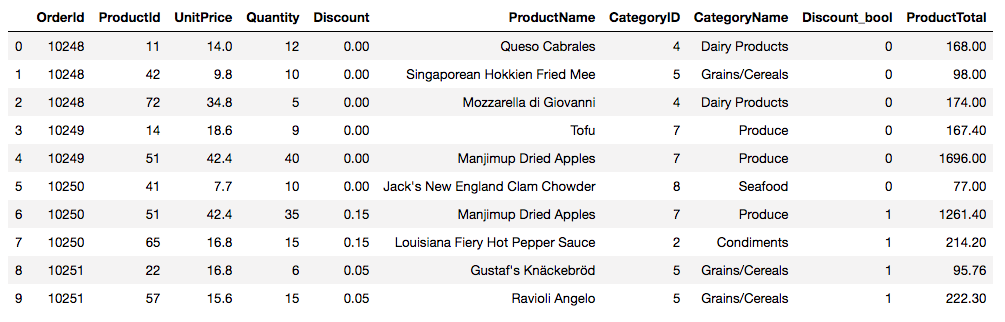
For my analysis, I need to group the observations by order number and then sort the orders into two groups: orders with one or more discounted items, and orders with no discounted items.
# Assume my data is stored in a DataFrame called `df`

# Get list of orders where no items are discounted
group_by_discount_bool = pd.DataFrame(df.groupby('OrderId')['Discount_bool'].sum())
ids_no_disc = group_by_discount_bool[group_by_discount_bool.Discount_bool == 0]
ids_no_disc = list(ids_no_disc.index)

# Get list of orders with at least one discounted item
ids_with_disc = group_by_discount_bool[group_by_discount_bool.Discount_bool > 0]
ids_with_disc = list(ids_with_disc.index)

# Subset products by whether they occur in orders with discounts or not
orders_discount = df[df.OrderId.isin(ids_with_disc)]
orders_no_discount = df[df.OrderId.isin(ids_no_disc)]

# Group by order; these orders contain ONE OR MORE discounted items
orders_discount = orders_discount.groupby('OrderId')['ProductTotal'].sum()

# Group by order; these orders contain NO discounted items
orders_no_discount = orders_no_discount.groupby('OrderId')['ProductTotal'].sum()
This leaves me with two one-dimensional arrays (orders_discount and orders_no_discount) containing the total dollar values of orders with and without discounts, respectively. The purpose of my hypothesis test is to determine whether the means of these two arrays are significantly different.
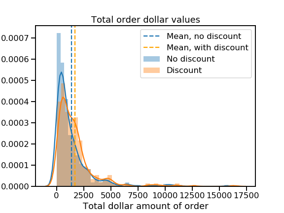
But before I do that, let’s take a look at the distributions themselves.
A skewed perspective
Uh oh.
That’s some mighty positive skew! It looks like most orders total under $5,000, but a few massive ones are giving both distributions long right tails. I worry that these huge orders may not be representative of most customers’ behavior.
Let’s examine the distributions in greater detail to see what’s going on.
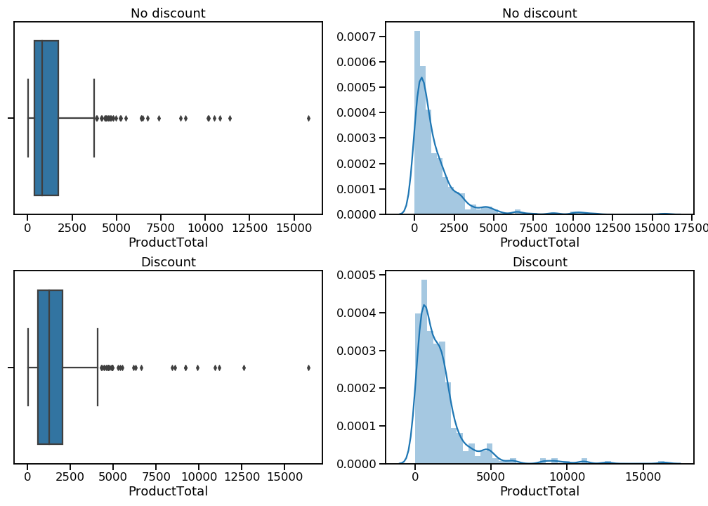
The kernel density estimation plots (right column) show me that both distributions do indeed have very long right tails. The box-and-whisker plots (left column) make it a little easier to see where these extreme values fall. I want to eliminate these mega-orders so I can focus my analysis on the buying behavior of the vast majority of customers.
To trim the distributions, I am going to remove values that fall beyond the right whisker, which represents 1.5 times the interquartile range (distance between 25th and 75th percentiles) of each distribution. In the case of these distributions, this trimming amounts to 7-8% of the available values. That’s a sacrifice I’m willing to make.
# Calculate the cutoff point (1.5*IQR + 75th percentile) for non-discounted
iqr = stats.iqr(orders_no_discount)
upper_quartile = np.percentile(orders_no_discount, 75)
cutoff = 1.5 * iqr + upper_quartile

# Remove outliers from non-discounted sample
orders_no_disc_trimmed = orders_no_discount[orders_no_discount <= cutoff]

# Calculate the cutoff point (1.5*IQR + 75th percentile) for discounted
iqr = stats.iqr(orders_discount)
upper_quartile = np.percentile(orders_discount, 75)
cutoff = 1.5 * iqr + upper_quartile

# Remove outliers from non-discounted sample
orders_disc_trimmed = orders_discount[orders_discount <= cutoff]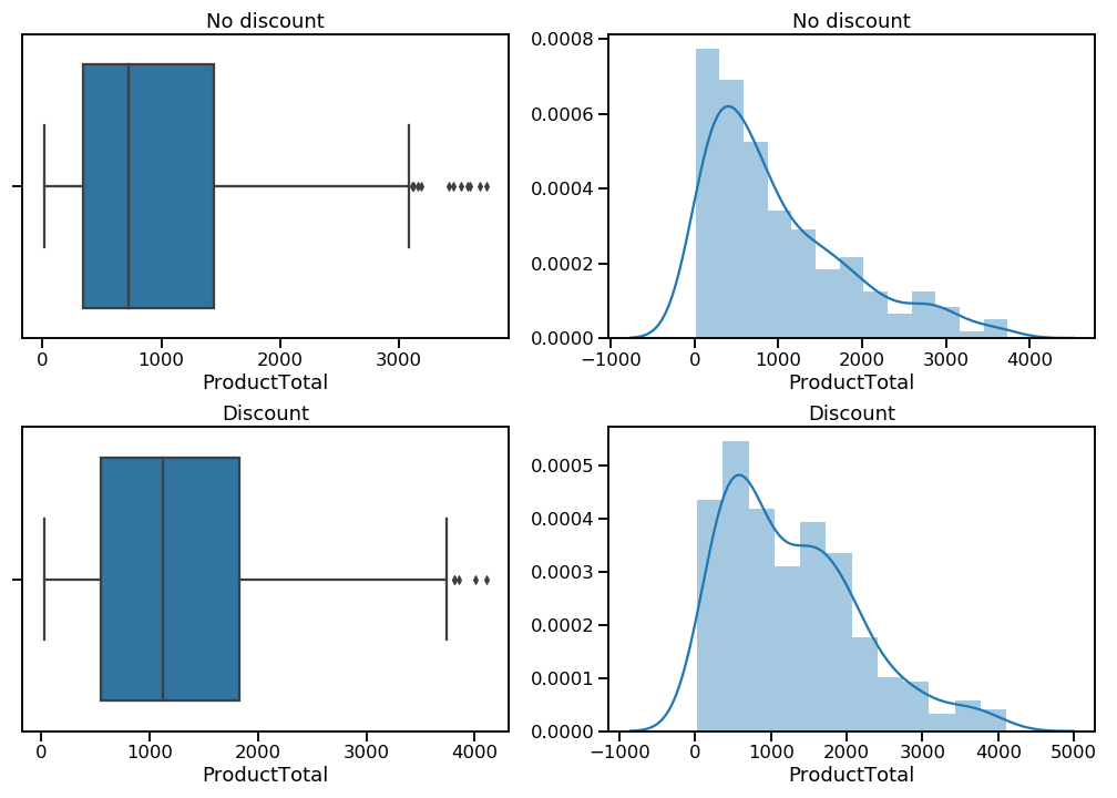
That’s better. There are now far fewer (and less extreme) outliers, and while the distributions are still positively skewed, they are much more normal-looking than before.
A quick Levene’s test indicates that the variances of these two samples are not statistically different. That’s good news for when I’ll want to calculate the power of my statistical test later on, but a Welch’s t-test would work either way.
Test it out
Unfortunately, there’s not a handy Python package for performing a Welch’s t-test, so I wrote my own and wrapped it in another that compares the t-statistic to my chosen alpha value and lets me know if I can reject (or fail to reject) the null hypothesis.
Here it is in action:
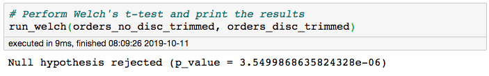
This yielded a p-value of 0.00000355, which is well below my chosen alpha value of 0.05. I reject the null hypothesis! Assuming there are no lurking variables at play, I can feel confident that there is a statistically significant difference between the average total dollar amount of orders with discounts and those without.
How big is that bump?
Now we know that orders containing discounted items tend to be larger than orders with no discounted items—but how different are they? To find out, let’s take a look at effect size, or the difference between the average order with discounts and the average one without.
I wrote myself some functions to calculate a raw effect size, use that to calculate a standardized effect size (Cohen’s d ), and then pass that to a power analysis. Note that my function for Cohen’s d accounts for the possibility that the two samples may have different lengths and variances, and my power analysis takes the average length of the two samples as the number of observations (“nobs1”). Here’s the code:
# Define a function to calculate Cohen's d
def cohen_d(sample_a, sample_b):
    """Calculate's Cohen's d for two 1-D arrays"""

    diff = abs(np.mean(sample_a) - np.mean(sample_b))
    n1 = len(sample_a)
    n2 = len(sample_b)
    var1 = np.var(sample_a)
    var2 = np.var(sample_b)
    pooled_var = (n1 * var1 + n2 * var2) / (n1 + n2)

    d = diff / np.sqrt(pooled_var)
    return d

# Define a function to calculate effect size and power of a statistical test
def size_and_power(sample_a, sample_b, alpha=0.05):
    """Prints raw effect size and power of a statistical test,
       using Cohen's d (calculated with Satterthwaite
       approximation)
       Dependencies: Numpy, scipy.stats.TTestIndPower"""

    effect = abs(np.mean(sample_a) - np.mean(sample_b))
    print('Raw effect size:', effect)

    d = cohen_d(sample_a, sample_b)
    power_analysis = TTestIndPower()

    sample_length = (len(sample_a) + len(sample_b)) / 2
    power = power_analysis.solve_power(effect_size=d,
                                       alpha=alpha,
                                       nobs1=sample_length)

    print('Power:', power)
And here it is in action:
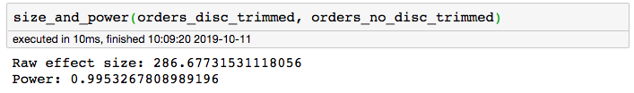
The raw effect size of 286.68 means that the difference between the mean order total with discounts and the mean order total without discounts is $286.68. The power of 0.995 means I have only a 0.05% chance of committing a Type II error (a.k.a a false negative). I was hoping for a power of at least 0.8, so I’m happy with this result. It is very likely that I have correctly detected a phenomenon that really exists—woohoo!
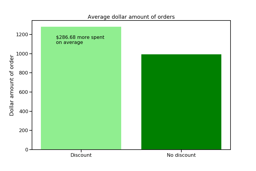
If we wanted to know whether $286.68 is a big difference, we could run my cohen_d() function on the two samples, which gives a value of 0.33. In the world of Cohen’s d values, we typically say that 0.2 is a small effect, 0.5 is a medium-sized effect, and 0.8 and up is a big effect, but this is all relative. If we run this test every year and always get a Cohen’s d value around 0.2, then one year get 0.33, we might consider that a big effect in our particular circumstances.
You can check out the rest of my project on the Northwind database in my GitHub repo. You can also view my presentation of the results for a non-technical audience on YouTube. Because I found it both helpful and beautiful, here’s a really excellent visualization to help you understand how sample size, effect size, alpha, and power are connected.