Recently, I was looking for a fun project to help me practice a couple of skills that I don’t get to use very often. In particular, I wanted a chance to call an API, scrape some data from a website, and do some cool visualizations in Tableau. What started off as a chance encounter with some data about pinball machines led me on an adventure that ended with an 80s-themed dashboard (below). In this post, I’ll walk you through how I built Pinball Wizardry, which took about 12 hours over the course of a week.
Inspiration
It all started with the weekly e-mail from Data Is Plural, by Jeremy Singer-Vine. In this newsletter (and in the Google Doc where all the newsletter content ultimately gets compiled), Singer-Vine shares interesting datasets on a dazzling array of topics, all of which are more or less open and free to use. A recent newsletter featured Pinball Map, a “crowdsourced map of public pinball machines” (per the website).
I noticed that Pinball Map has an API, so I started tinkering with it to see what kinds of data I could get.
Exploration
To fetch data from the API and return it in a DataFrame for easy manipulation, I created a little function:
# Import packages
import requests
import pandas as pd

# Define function to call API
def api_call(url, field):
    '''Fetches data from API into DataFrame
       Dependencies: requests, pandas'''

    response = requests.get(url)
    df = pd.DataFrame(response.json()[field])
    return df
This function calls the API, gets a response in JSON format, and then returns a particular part of the response (the specified field) in a DataFrame. I wanted the field called “machines,” since this stores data on individual machines (as opposed to locations, manufacturers, etc.).
# Get data on machines
machines = api_call('https://pinballmap.com/api/v1/machines.json', 'machines')
On inspecting the resulting DataFrame, I noticed that each machine had an “IPD ID” and an “IPD link.” I followed one of the links and learned that IPD stands for the Internet Pinball Database, a massive catalog of pinball machines with data on when and where they were made, how many were made, key features, artistic themes, etc. I decided to try scraping some of this data from the Internet Pinball Database to join to my data from Pinball Map.
Just scraping by
For anyone who has never tried to scrape a web page, I would describe it as both easy and hard. On the one hand, it’s fairly easy to draft code that grabs the HTML of a webpage and stores it locally for you to explore. On the other hand, extracting exactly what you want from that HTML can be tricky, especially if you are trying to scrape multiple pages and their format is not identical.
That’s exactly what happened when I tried to scrape the Internet Pinball Database. Although it was easy to find the data I wanted on any given page, formatting could vary slightly from one page to the next, so it was tricky to write a function to find the number of machines produced, for example, for each of 1,000+ machines. This turned out to be a fantastic exercise in writing regular expressions, since I could use those to find and extract pieces of information based on their immediate contexts (rather than looking for them in the nth table row or something like that).
I’ll break down my scraping functions one at a time so you can see how they work (and maybe use them to build your own).
# Import packages needed for the whole scraping project
import re
import requests
import pandas as pd
from bs4 import BeautifulSoup
import time

# Define a function to scrape a page into a bs4 object
def get_data_table(url):
    '''Returns main table data from web page as type bs4.element.ResultSet.
       Dependencies: bs4.BeautifulSoup, requests'''

    html_page = requests.get(url)
    soup = BeautifulSoup(html_page.content, 'html.parser')
    table = soup.find('table')
    table_contents = (table.nextSibling.nextSibling.nextSibling.nextSibling
                      .nextSibling.nextSibling.nextSibling.nextSibling
                      .nextSibling)
    table_data = table_contents.findAll('tr')
    return table_data
This first function visits the specified URL, grabs everything stored in a table in the middle of the page body, and extracts that content into a special object from the bs4 package. This object contains all the data of interest from a given a page, but to get any specific datum, I need some more targeted functions.
My next function doesn’t actually require the table_data generated above; it just extracts the IPD ID of a given machine from its IPD URL. This is useful for creating an index for the DataFrame I’m building, since each machine’s IPD ID is supposed to be unique.
# Define a function to extract the IPD ID from a url
def get_id(url):
    '''Extracts machine's IPD ID from url.'''
    idx = int(re.findall(r'=(\d+)', str(url))[0])
    return idx
Now we start getting into the more complicated stuff. The following function looks for the machine’s “Average Fun Rating,” which can be an integer number or one of various strings indicating that the machine has not been rated. If you visit an IPDB.org page, you’ll see that what I’m actually scraping here is the number of stars displayed as a visualization of the machine’s rating, not the float value given as the “average” rating. I decided that a 10-point integer scale was a good enough rating system for my purposes.
# Define a function to extract the star rating
def get_rating(table_data):
    '''Returns game rating from table data.
       Dependencies: bs4.BeautifulSoup, re'''

    if 'Average Fun Rating' in str(table_data):
        if (('No ratings on file' in str(table_data))
            or ('Needs More Ratings!' in str(table_data))):
            value = None
        else:
            value = int(re.findall(r'/(\d+)stars.png', str(table_data))[0])
    else:
        value = None

    return value
Note that the function above first checks whether “Average Fun Rating” is present at all. It took me a few tries to learn that not all pages even include a rating, so it’s important to screen for that first to avoid throwing an error.
Next up is a function to extract the number of flippers on a machine. This one was pretty straightforward to write, since the number of flippers is always presented in the same way. I used a regular expression to find the word “Flippers” and grab the number that comes after it in parentheses.
# Define a function to extract number of flippers
def get_flippers(table_data):
    '''Returns number of flippers from table data.
       Dependencies: bs4.BeautifulSoup, re'''

    if 'Flippers</a> (' in str(table_data):
        flippers = int(re.findall(r'Flippers</a>\s\((\d+)', str(table_data))[0])
        return flippers
    else:
        return None
The next function was by far the hardest to get right, and it all came down to finding the regular expression that could accurately capture all the sorts of numbers used to express how many units of a given machine a company produced. These numbers range from 0 to 50,000, so I needed an expression that could capture integers with or without commas in the middle. Regexr.com was a lifesaver for this task because it let me write my own test cases and then fiddle with the regular expression until I found the best one.
# Define a function to extract number of units manufactured
def get_units(table_data):
    '''Returns number of units manufactured from table data.
       Dependencies: bs4.BeautifulSoup, re'''

    if 'Production:' in str(table_data):
        if 'Never Produced' in str(table_data):
            units = 0
        else:
            units = int(re.findall(r'"baseline">(\d+,?\d*)\sunit',
                               str(table_data))[0].replace(',', ''))
            return units
    else:
        return None
The last function wraps the previous ones together with a few little bells and whistles to make the scraping easier to troubleshoot. Basically, the function takes in a list of URLs, scrapes the HTML from each one, extracts the relevant data into lists, and then compiles all the lists into a DataFrame at the end. I included a brief pause after scraping each page to avoid overburdening the IPDB.org server. I also set up an exception to let me know which URL wasn’t working if the function threw an error. This was extremely helpful during testing because it let me investigate the exact webpage where things had gone wrong (which usually meant that that page had some formatting different from the others).
# Define a function to scrape all the desired data into a DataFrame
def scrape_urls(urls):
    '''Pulls desired data into a DataFrame
       Dependencies: bs4.BeautifulSoup, time, requests, re, pandas'''

    # Initialize lists
    ids = []
    ratings = []
    flippers = []
    units = []

    # Scrape each page and collect data
    try:
        for url in urls:
            if len(url) > 0:
                table_data = get_data_table(url)
                ids.append(get_id(url))
                ratings.append(get_rating(table_data))
                flippers.append(get_flippers(table_data))
                units.append(get_units(table_data))

                # Pause to avoid jamming server
                time.sleep(0.1)
            else:
                continue

    # On error, print the url of the offending page
    except (ValueError, KeyError, TypeError, IndexError):
        print('The problem child is IDP ID #', get_id(url))

    # Concatenate the results into a DataFrame
    results = pd.concat([pd.Series(ids, name='ipd_id'),
                         pd.Series(ratings,  name='rating'),
                         pd.Series(flippers, name='flippers'),
                         pd.Series(units, name='units')], axis=1)
    return results
I used one last trick to help me track the scraping in progress, and that was to scrape groups of 100 URLs at a time and print out the number of each group as it finished. This just helped me know where the function was at any given time so I could track how quickly it executed. Scraping each group of URLs into its own DataFrame also ensured that, even if the function failed at some point, I would at least have captured some of the data, and I could rerun the function from the point where it quit working.
# Split URLs into groups of 100
urls = list(machines['ipdb_link'])
n = 100
chunks = [urls[i * n:(i + 1) * n] for i in range((len(urls) + n - 1) // n )]

# Scrape each group of URLs
dfs = []
counter = 0
for chunk in chunks:
    scrape_data = scrape_urls(chunk)
    dfs.append(scrape_data)
    counter += 1
    print('Chunk {} complete'.format(counter))

# Concatenate the chunks
all_scrape_data = pd.concat(dfs, axis=0)
After a little manipulation to make the two datasets easier to join, I combined the data pulled from the Pinball Map API and the data from IPDB.org into one big DataFrame, which I then exported as a CSV for use in Tableau. I left a lot of missing values unresolved at this point because I was curious to see how Tableau would handle them (pretty well, it turns out).
Tableau time
If you’ve never used Tableau for data visualization, I encourage you to try the free version (called “Tableau Public”). You’ll be prompted to create an account and download the software. With a public account, you’ll only be able to save your work to the cloud, but you can set the visibility on anything you build to “private” if you don’t want it to be easy for others to see. For the purpose of practicing using Tableau, I find this solution to be fine and worth the hassle of not being able to save locally.
The basic Tableau workflow is to import your data, do any cleaning/manipulation you want, and then create visualizations one by one, each on its own “sheet” (like a sheet of an Excel workbook). One you have some sheets going, you can build a dashboard to display the contents of one or more sheets. You can also build a “story,” which is more like a slide deck with a visualization or other content on each page. Like all vendor products for data visualization, Tableau does some things really well and other things not well at all, so as long as you can fit your needs into the box of what Tableau does well, you’ll be fine.
I imported my data and got to work on my first visualization, a bubble plot to express the average rating of machines by manufacturer, also accounting for how many ratings were available for each manufacturer.
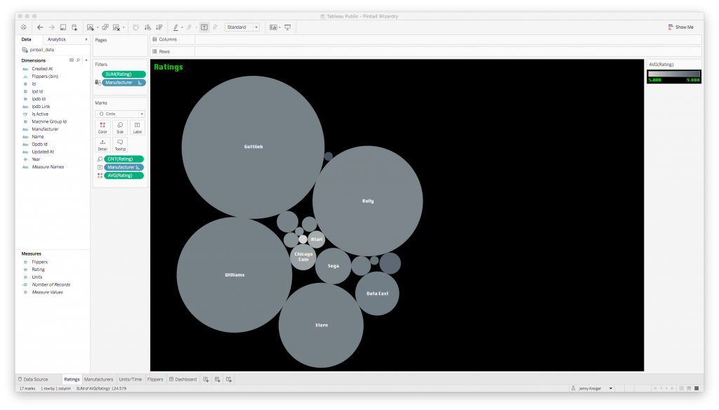
Generally speaking, bubble plots are not a great way to visualize data because a) our eyes are not good at comparing the relative sizes of circles, and b) it’s not immediately clear whether we should be comparing the circles in terms of their diameters or their areas. I went with the bubble plot anyway because I just wanted to convey which manufacturers had the most and best ratings at a glance, and this type of plot would offer some contrast to the bar plots I knew I needed elsewhere. If the ratings data were very important, I would find a more precise way to communicate it, but this will do for now.
Next up was a bar plot to show how many of each machine were produced. Note that scroll bar; there are about 1,000 machines in my dataset!
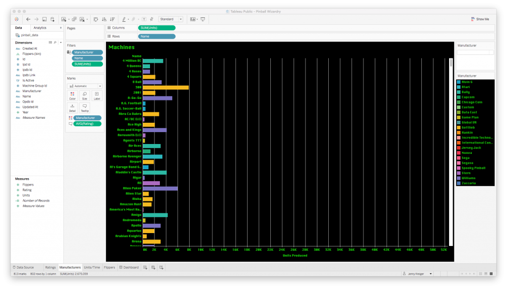
The bars are color-coded by manufacturer, and if you hover over a bar, a tooltip pops up to tell you the machine name, manufacturer name, average rating, and number produced.
Next: a line plot to convey how many machines each company produced over time.
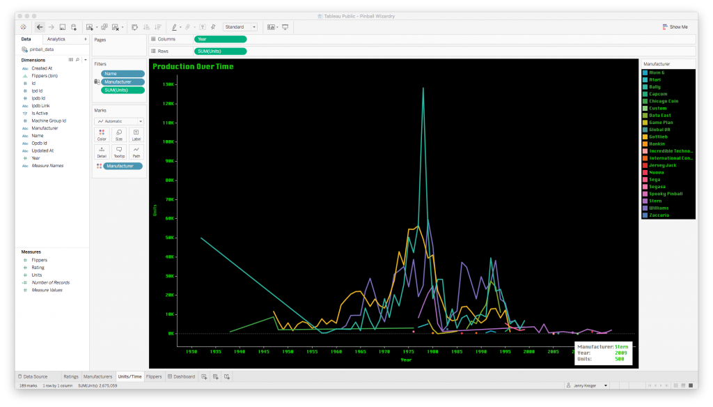
Creating a plot like this is super easy: you just drag whatever you want to be your values from the list of field names at the left to the “Columns” or “Rows” fields at the top. A plot is generated instantly, and then you can manipulate it by dragging in more fields to map to the color or size of the plotted elements, or by changing the aggregation function from sum to average, for instance.
Finally, I wanted a histogram to represent the most popular counts of flippers.
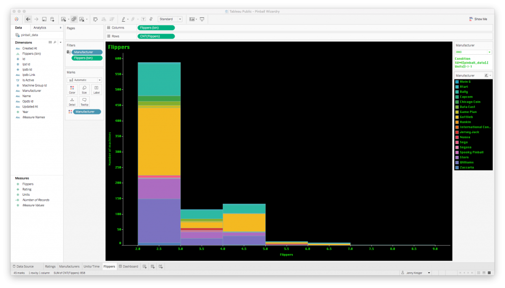
The histogram bars are so colorful because I asked Tableau to keep using the color code by manufacturer that I set up earlier. This helps us see both the overall count of machines with a given number of flippers, and the count by manufacturer.
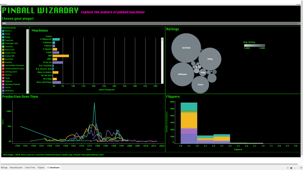
Finally, it was time to bring all these plots together in an interactive dashboard.
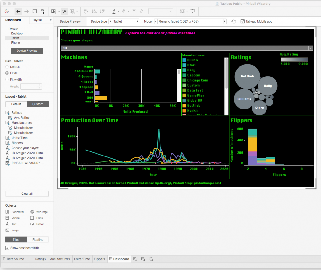
Building a dashboard in Tableau takes a bit of patience. You have the option to plug your plots into predetermined slots on a field of a certain size, or to make your plots “floating” so that you can position them anywhere you want. While dealing with the predefined slots can be frustrating, I highly recommend doing it because it ensures that your plots will move and scale correctly in response to the size of the browser being used to view your plot.
You have the option to design just one dashboard layout or to customize your layout for each of four different device types: phone, tablet, desktop, and default (which is between phone and tablet in width). Although this is a lot of extra tweaking to do, I highly recommend it because it helps ensure that the majority of users see your dashboard as you intended it to look.
You can view the code for this project in my GitHub repo, and you can interact with the live dashboard on Tableau Public. I hope this inspires you to try out web scraping and Tableau for a project of your own. If you’re just looking for practice, then I highly recommend browsing Data Is Plural for a dataset that piques your curiosity. Troubleshooting is much easier when you’re having fun!