The Random Forest is a powerful tool for classification problems, but as with many machine learning algorithms, it can take a little effort to understand exactly what is being predicted and what it means in context. Luckily, Scikit-Learn makes it pretty easy to run a Random Forest and interpret the results. In this post I’ll walk through the process of training a straightforward Random Forest model and evaluating its performance using confusion matrices and classification reports. I’ll even show you how to make a color-coded confusion matrix using Seaborn and Matplotlib. Read on!
The dataset for this tutorial was created by J. A. Blackard in 1998, and it comprises over half a million observations with 54 features. Each observation represents a 30-by-30-meter tract of land in wilderness areas in Colorado. The features record cartographic data about each tract: elevation, aspect, distance to water/roads/past wildfire ignition points, amount of shade at various times of day, and which of 40 soil types it contains. You can find the full dataset and a description over at the UCI KDD archive.
Get ready
Before we trek into the Random Forest, let’s gather the packages and data we need. We’re going to need Numpy and Pandas to help us manipulate the data. I’m also importing both Matplotlib and Seaborn for a color-coded visualization I’ll create later.
We also need a few things from the ever-useful Scikit-Learn. From sklearn.model_selection we need train-test-split so that we can fit and evaluate the model on separate chunks of the dataset. We need our RandomForestClassifier, of course, and from sklearn.metrics we will want accuracy_score, confusion_matrix, and classification_report. Load ’em up!
# Import needed packages
import numpy as np
import pandas as pd
import matplotlib.pyplot as plt
import seaborn as sns

from sklearn.model_selection import train_test_split
from sklearn.ensemble import RandomForestClassifier
from sklearn.metrics import accuracy_score, confusion_matrix, classification_report

# If you're working in Jupyter Notebook, include the following so that plots will display:
%matplotlib inline
Now we’re ready to grab the data. If you’re downloading a copy of the data to your local machine, be advised that it is about 75MB in size.
# Import the dataset
df = pd.read_table("covtype.data", sep=',', header=None)
The DataFrame df contains 54 columns representing features and one column containing the target (labels) called Cover_Type. Let’s split the data up into features and target.
# Split dataset into features and target
y = df['Cover_Type']
X = df.drop('Cover_Type', axis=1)
Easy enough! I’m curious to see how many of each class we have. Let’s check the value counts:
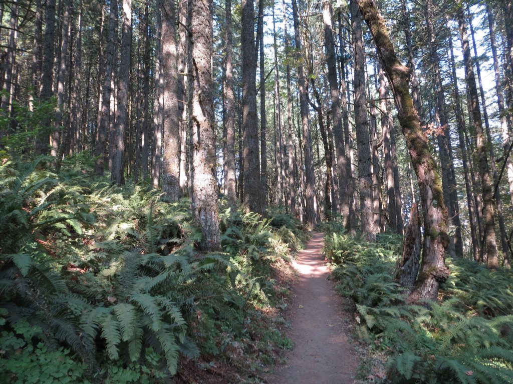
# View count of each class
y.value_counts()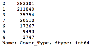
The classes are pretty imbalanced—the smallest one is about 1% the size of the biggest! Modeling with data with this much class imbalance is a bit risky because models can’t see the big picture. They want to find a way to maximize whatever evaluation metric you’re using, and to do this, they might find shortcuts. For instance, if you had two classes, one of which had 99 examples and the other just 1, a model could always predict the first class, and it would be right 99% of the time! The model would score highly on accuracy, but it wouldn’t actually help you identify examples of the smaller class.
Since this is a quick-and-dirty model for the purposes of looking at some evaluation tools, I won’t bother balancing the classes now. Just know that you can do this pretty easily with some tools from Imbalanced-Learn.
We’re going to want to evaluate how the Random Forest performs on data it hasn’t seen before, and that means we need to do a train-test split.
# Split features and target into train and test sets
X_train, X_test, y_train, y_test = train_test_split(X, y, random_state=1, stratify=y)
There are two important things I want to point out in the code above. First is that I set a random_state; this ensures that if I have to rerun my code, I’ll get the exact same train-test split, so my results won’t change. I wouldn’t want to spend all day trying to evaluate a model whose outputs change every time I need to restart my kernel!
The second thing I want to point out is stratify=y. This tells train_test_split to make sure that the training and test datasets contain examples of each class in the same proportions as in the original dataset. This is especially import to do because of how imbalanced the classes are. A random split could easily end up with all examples of the smallest class in the test set and none in the training set, and then the model would be unable to identify that class.
Into the woods
The data is ready to roll. Time to get that Random Forest up and running! If you’ve ever worked with Scikit-Learn, you know that many modeling classes have the exact same interface: you instantiate a model, call .fit() to train it, and then call .predict() to get predictions. I’ll instantiate a RandomForestClassifier() and keep all default parameter values.
# Instantiate and fit the RandomForestClassifier
forest = RandomForestClassifier()
forest.fit(X_train, y_train)
When you fit the model, you should see a printout like the one above. This tells you all the parameter values included in the model. Check the documentation for Scikit-Learn’s Random Forest classifier to learn more about what each parameter does.
Now we can get predicted labels for the test data:
# Make predictions for the test set
y_pred_test = forest.predict(X_test)
And now for our first evaluation of the model’s performance: an accuracy score. This score measures how many labels the model got right out of the total number of predictions. You can think of this as the percent of predictions that were correct. This is super easy to calculate with Scikit-Learn using the true labels from the test set and the predicted labels for the test set.
# View accuracy score
accuracy_score(y_test, y_pred_test)
This model has an accuracy score of 94% on the test data. That seems pretty impressive, but remember that accuracy is not a great measure of classifier performance when the classes are imbalanced. We need more information to understand how well the model really performed. Did it perform equally well for each class? Were there any pairs of classes it found especially hard to distinguish? Let’s find out with a confusion matrix.
Confusion matrix
A confusion matrix is a way to express how many of a classifier’s predictions were correct, and when incorrect, where the classifier got confused (hence the name!). In the confusion matrices below, the rows represent the true labels and the columns represent predicted labels. Values on the diagonal represent the number (or percent, in a normalized confusion matrix) of times where the predicted label matches the true label. Values in the other cells represent instances where the classifier mislabeled an observation; the column tells us what the classifier predicted, and the row tells us what the right label was. This is a convenient way to spot areas where the model may need a little extra training.
Scikit-Learn’s confusion_matrix() takes the true labels and the predictions and returns the confusion matrix as an array.
# View confusion matrix for test data and predictions
confusion_matrix(y_test, y_pred_test)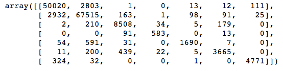
Straightaway we can see that there are some large values in off-diagonal cells in the first and second columns, meaning that the classifier predicted classes 1 and 2 lots of times when it shouldn’t have. This isn’t surprising; those are the two biggest classes, and the classifier could get a lot of its predictions right just by guessing one of those two classes over and over.
This confusion matrix would be a lot easier to read if it had some labels and even a color scale to help us spot the biggest and smallest values. I’ll use a Seaborn heatmap() to do this. I will also normalize the values in the confusion matrix, since I find percents easier to understand than absolute counts when the classes are of such different sizes.
# Get and reshape confusion matrix data
matrix = confusion_matrix(y_test, y_pred_test)
matrix = matrix.astype('float') / matrix.sum(axis=1)[:, np.newaxis]

# Build the plot
plt.figure(figsize=(16,7))
sns.set(font_scale=1.4)
sns.heatmap(matrix, annot=True, annot_kws={'size':10},
            cmap=plt.cm.Greens, linewidths=0.2)

# Add labels to the plot
class_names = ['Spruce/Fir', 'Lodgepole Pine', 'Ponderosa Pine',
               'Cottonwood/Willow', 'Aspen', 'Douglas-fir', 'Krummholz']
tick_marks = np.arange(len(class_names))
tick_marks2 = tick_marks + 0.5
plt.xticks(tick_marks, class_names, rotation=25)
plt.yticks(tick_marks2, class_names, rotation=0)
plt.xlabel('Predicted label')
plt.ylabel('True label')
plt.title('Confusion Matrix for Random Forest Model')
plt.show()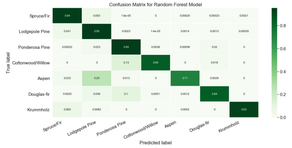
Nice! Now it’s easy to see that our classifier struggled at predicting the Aspen label. About a quarter of the time, Aspens were mislabeled as Lodgepole Pines!
Classification report
To get even more insight into model performance, we should examine other metrics like precision, recall, and F1 score.
Precision is the number of correctly-identified members of a class divided by all the times the model predicted that class. In the case of Aspens, the precision score would be the number of correctly-identified Aspens divided by the total number of times the classifier predicted “Aspen,” rightly or wrongly.
Recall is the number of members of a class that the classifier identified correctly divided by the total number of members in that class. For Aspens, this would be the number of actual Aspens that the classifier correctly identified as such.
F1 score is a little less intuitive because it combines precision and recall into one metric. If precision and recall are both high, F1 will be high, too. If they are both low, F1 will be low. If one is high and the other low, F1 will be low. F1 is a quick way to tell whether the classifier is actually good at identifying members of a class, or if it is finding shortcuts (e.g., just identifying everything as a member of a large class).
Let’s use Scikit-Learn’s classification_report() to view these metrics for our model. I recommend wrapping it in a print() so that it will be nicely formatted.
# View the classification report for test data and predictions
print(classification_report(y_test, y_pred_test))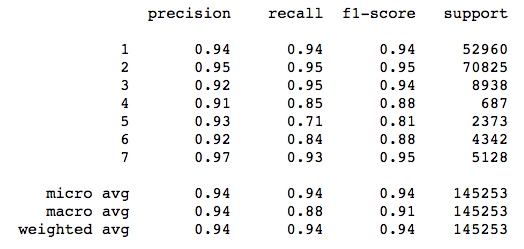
Check out the metrics for class 5 (Aspen). Precision is high, meaning that the model was careful to avoid labeling things “Aspen” that aren’t Aspens. On the other hand, recall is relatively low, which means that the classifier is missing a bunch of Aspens because it is being too careful! The F1 score reflects this imbalance.
On its own, a classification report tells us generally what kind of errors the model made, but it doesn’t give us specifics. The confusion matrix tells us exactly where mistakes were made, but it doesn’t give us summary metrics like precision, recall, or F1 score. Using both of these can give us a much more nuanced understanding of how our model performs, going far beyond what an accuracy score can tell us and avoiding some of its pitfalls.